What is Mobile Friendly Test tool?
This is Genelify Mobile Friendly Test tool to check mobile friendly status on webpage, mobile friendly is very important to reach users from smartphone devices. You can see several indicators to check whether a web page is mobile friendly or not, considering that mobile friendly component is very important.
Mobile friendly is an important element for increasing brand awareness on your business website. Internet traffic almost entirely comes from mobile devices, therefore it is very important to make website pages mobile friendly for user convenience.
Modern web using responsive web design
Modern websites are required to use responsive web design in appearance to the user, it is common knowledge that almost internet users mostly use their smartphones compared to using computers. So that your website can be accessed on any device, responsive design is very important in your web system.
By using responsive design, your website will be mobile friendly for users that can be used on any device such as smartphones, tablets or computers. This tool will help you to detect whether your website is already using a responsive web design or not.
What is Responsive Web Design
Responsive Web Design is a situation where the website has a neat UI design using certain methods, to produce a synchronous display on mobile devices, tablets, TVs with various resolutions. CSS or Cascading Style Sheets is a technology for laying out website design that allows it to be flexible and can be optimized without reducing several other elements. This method optimizes CSS to configure elements that can be adaptive if the user switches from a laptop to a smartphone and vice versa. Responsive Web Design is needed because it adjusts the website design according to the device accessed by the user and continues to grow due to fast smartphone and tablet technology with different screen resolutions. With this method, this can be overcome without eliminating the elements on the website.
What is the function of Responsive Web Design?
Some elements on websites that we often encounter such as text, videos and images. This image is crucial if not optimized because it will affect website performance and it is difficult to adjust the resolution in different screens. Image resolution is one of the difficulties for UI developers to adjust to various device screens. That's because images have different resolutions and qualities. If the image is too large, the website will slow down, if it is too small it will break. Likewise with videos, for example, you insert YouTube videos into the website. If the size of the video is not considered when appearing on the website, this will make the website uncomfortable when browsing, just imagine if the number of videos is not small. With this method, all these things can be overcome with some additional CSS syntax to adjust the size to any device. Responsive Web Design can adjust the resolution of images or videos in various screens. Making images and videos flexible when users access the website, also makes the website better in terms of User Interface.
Principles and how Responsive Web Design works
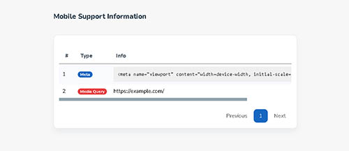
According to Tutsplus, to have a responsive website design, basic principles must be met in order to work properly, these principles are Media Queries, Fluid Grids and Responsive Media and can also use the viewport meta tag when the device cannot determine the width from the website when media queries are not triggered.
Fluid Grids
Fluid Grids are boundaries that define the location of a component in a layout that can change according to visuals. Fluid Grids will adapt to any width because they follow units of relative size like percentage units or em units instead of fixed units like pixels.
Media Queries
Media Queries allows you to be more specific with responsive layout designs and can adjust to certain sizes. Media Queries collect data to help layouts determine screen sizes on different devices with appropriate CSS styles.
Responsive Media
The last core principle is Responsive Media. Responsive Media is very important on modern websites that use images, videos or other media a lot. Please note that these types of content have different size responses. When image media set image dimensions with CSS, it will not work in responsive designs because the unit sizes are fixed. The property used in media-responsive designs can be by using max-width on media file types such as images or videos. This property ensures that the size does not exceed the width limit which has been scaled based on the screen size. The value of the max-width property must be set to max-width: 100%.
Viewport Meta Tag
The Viewport meta tag is needed when media queries are not triggered, this is because the device cannot determine the initial width of the website. The Meta Tag Viewport was first used by Apple to solve this problem for their iPhone devices. The viewport area is usually set to 1 in the height and width values. which optimizes the issue of not being able to recognize the scale of the site by using the ratio between height and width on the device size.